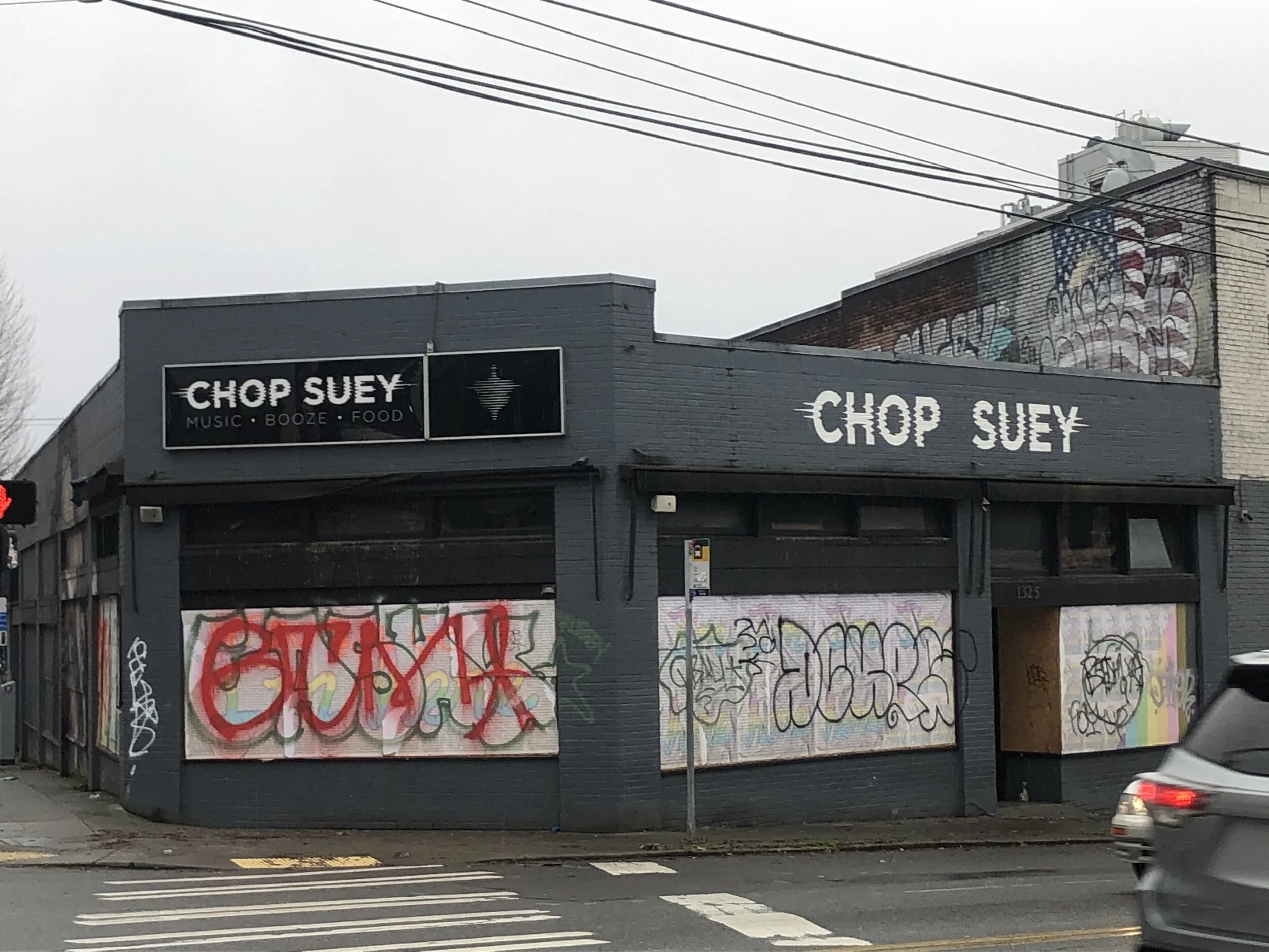
Chop suey
BRANDING
A staple of the seattle music community, chop suey has been hosting shows since 2002. after a change of owner the team decided it was time to update from the blatantly offensive logo and find something that represented the true nature of the space.PROJECT IN COLLABORATION W/ WE ARE UNICORNS
PROCESS
The original logo was obviously not appropriate. I worked to find a solution that strayed from all asian connotations but still had purpose and meaning to the brand.
After working through sketches i started to gravitate towards distorting the lettering and trying to incorporate the idea of “chopping” but that still didn’t feel like enough.
On a desperation for inspiration I walked around the office one day with my laptop and had each of my coworkers say the words “ chop suey” into the mic. it turned out to be a perfect starting point for the logo mark and logotype.
my favorite part of branding is creating a story with meaning. if it doesn't spark a conversation it doesn't have enough purpose to live on for more people to enjoy. i have had a lot of fun asking people what they thought of the mark, some people think its a top, some people think it looks like the space needle. the best day of my design life was when someone told me " hey did you know that logo is actually sound waves of someone saying chop suey?"


